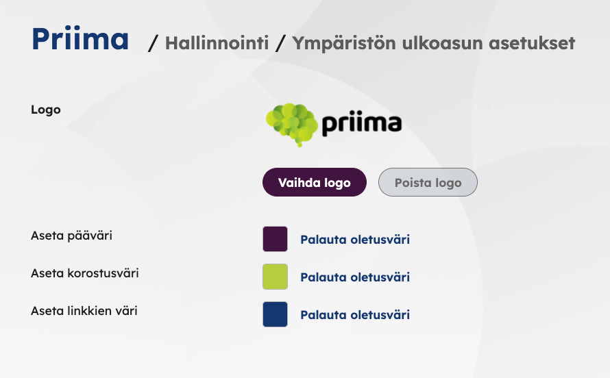
The layout settings of the environment define the environment’s logo and the environment’s primary color and highlight color, as well as the color of the links. Priima’s default colors can also be restored in the settings.
The recommended height of the image logo is 58 px and the width of the image can be a maximum of 293 px. The logo is displayed with a light background color, so it should be dark in color.
The logo can be larger than 293 x 58 px, but the aspect ratio of the image should not be wider than 293 : 58. If the image is wider, it overlaps Priima’s function texts in some situations. If necessary, you can add empty space below and above the logo, for example by editing with an image editing program. If necessary, you can contact Priima Helpdesk about editing the logo.
The main color affects, for example, various buttons, the appearance of the course editor and the coloring of the dashboard texts. In connection with the main color, the buttons have white text, so we recommend setting the main color to a dark color.
A hughlight color is a secondary color that is used with the main color in different elements. The highlight color appears, for example, as the color of some selections or function buttons. In connection with the highlight color, the buttons have black text, so we recommend a lighter color as the accent color.
The color of the links affects all the links in the environment. As the color of the links, you should choose a color that stands out enough so that the links can be noticed even among the body text.